Flag, Arms and Graphic Identity of Hong Kong
Government of the Hong Kong Special Administrative Region, 1997.
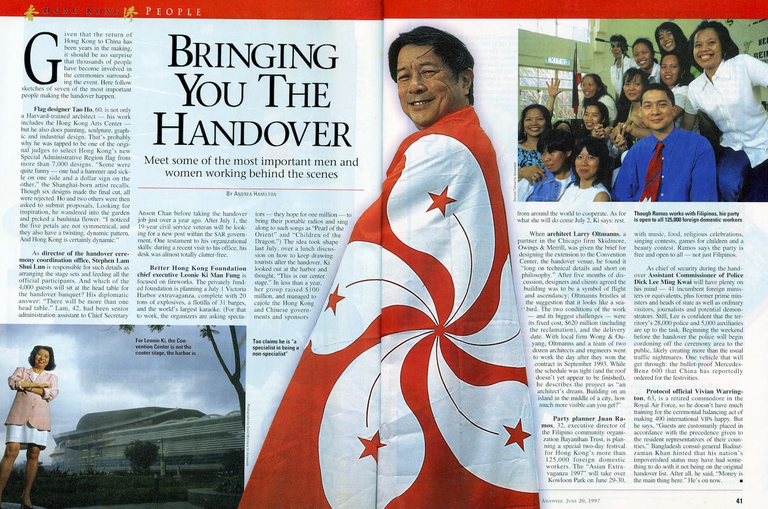
On 1 July 1997, Hong Kong’s sovereignty was transferred from Britain to China. Its status as a self-governing city-state with its own laws, a separate currency, an independent judicial system and a separate citizenship, remained intact. Hong Kong’s reversion to China, while a momentous and historic event, ushered in only cosmetic changes to the lives of Hongkongers. Taoho Design was authorized by Hong Kong’s and China’s governments to realize these cosmetic changes by creating a new graphic identity for the Hong Kong Special Administrative Region, in the form of a new flag and symbol.
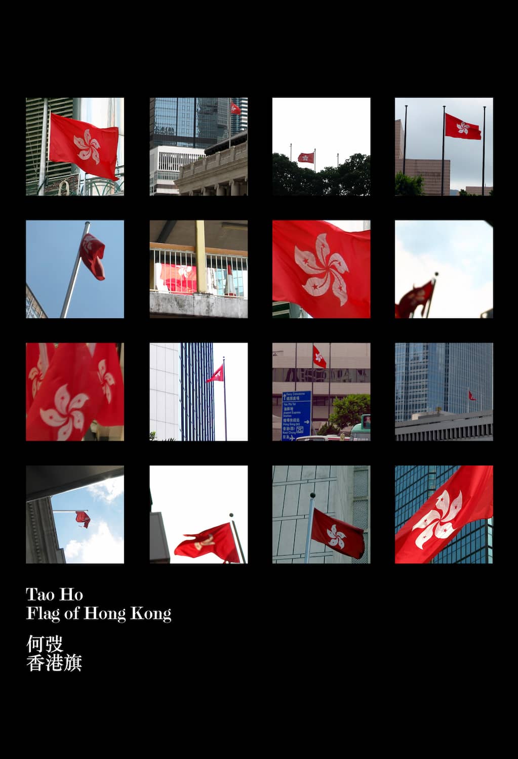
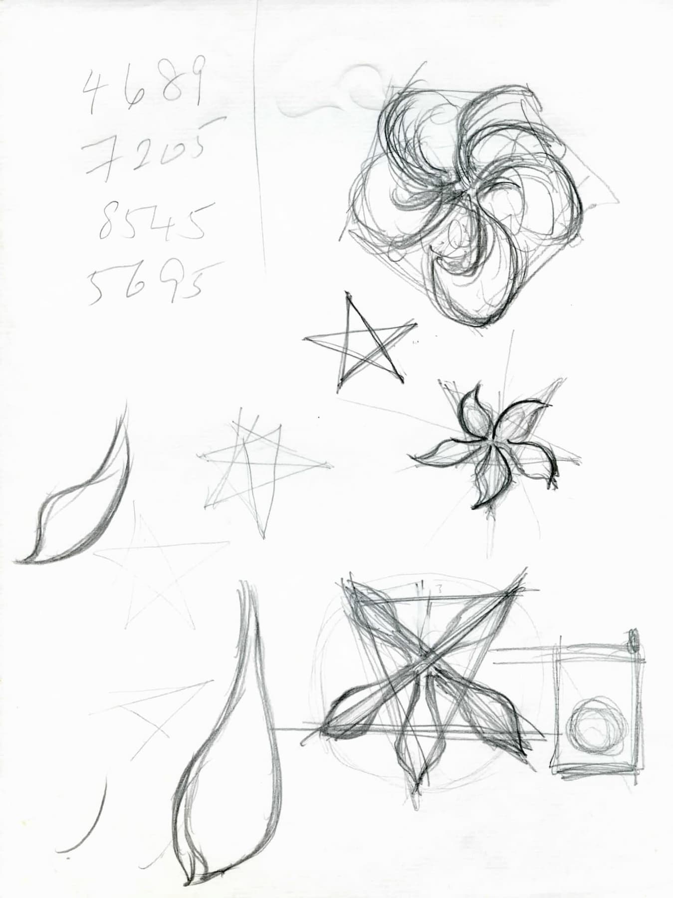
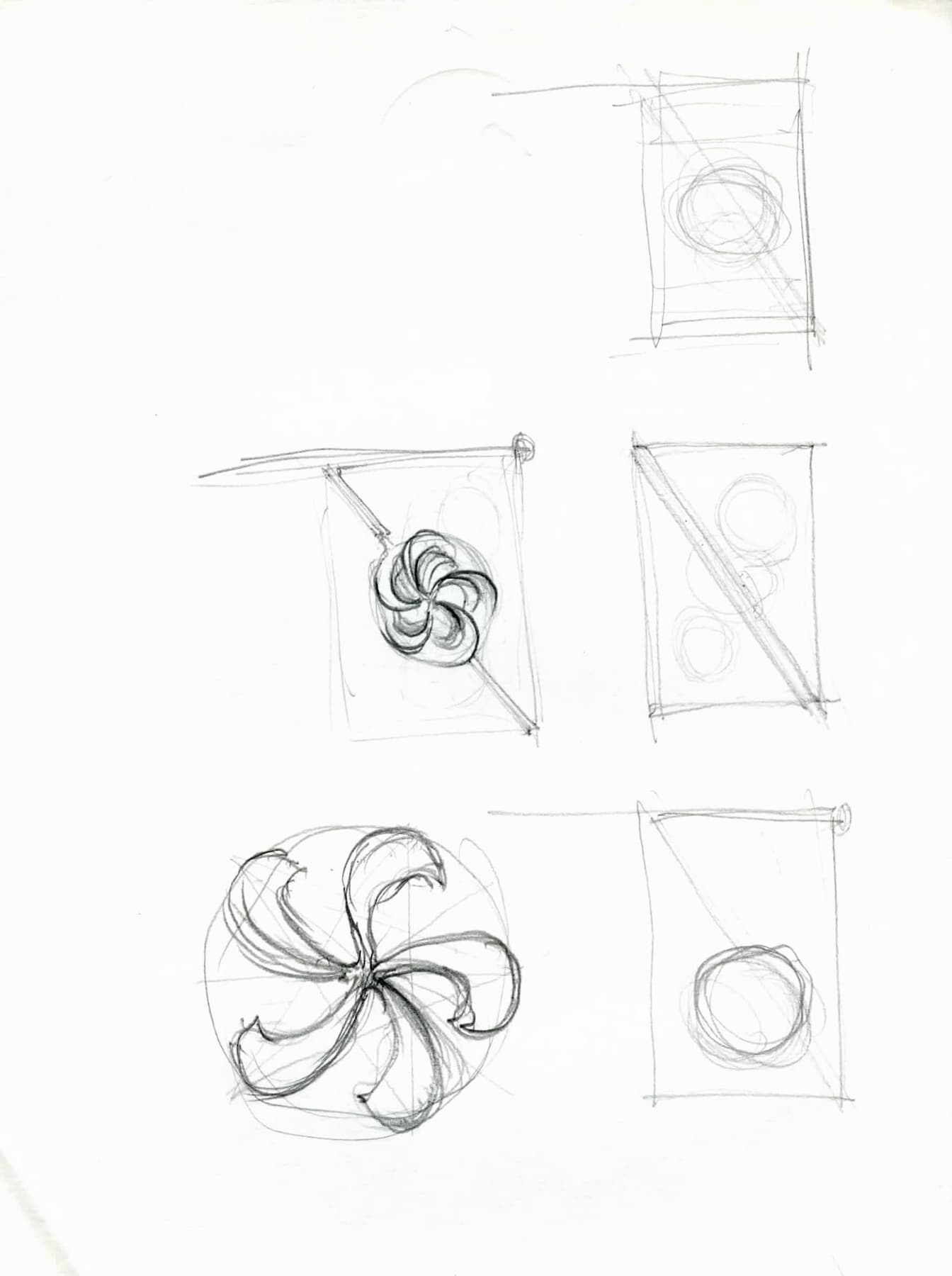
The design for the flag adopts the official flower of Hong Kong—the bauhinia—as a central theme. The stylized flower is asymmetrical, and therefore its form implies movement, alluding to Hong Kong’s democratic energy and economic vitality. The red background represents China and the five stars within the flower’s petals hint at the integration of the “one country, two systems” policy adopted by the Chinese and British governments to preserve Hong Kong’s self-government. The bauhinia symbol is incorporated into Hong Kong’s official emblem, where it is placed at the centre of a circular seal framed by the name, “Hong Kong” in both English and Chinese, Hong Kong’s two official languages. Today, our stylised bauhinia is omnipresent in the lives of Hongkongers as it appears in a variety of places, from Hong Kong Dollar banknotes and stamps, to passports and official documents, to the symbols of Hong Kong government agencies and major institutions, many of which we were commissioned to update to reflect the establishment of the Hong Kong SAR.
Much like the maple leaf of Canada, the Union Jack of Britain, or France’s Marianne, our design of the bauhinia has become the icon of Hong Kong and her people.
